
Good product owners deeply understand their users. Great product owners also understand non-adopters, too. This group has secrets for the product owner that often stay concealed because POs are too fixed on active users. This is not strictly true, but Eric Weber describes the idea concisely:
“Talk to the non-adopters. I *love* when people tell me something my team has built does incredible things for them. But that is like using sales to measure demand. What about the people who would have used it but were blocked for some reason? Were there any access issues? Were they confused at the takeaway message? Did they not know how to find what you created? If you don’t think about the potential audience and only curate for the existing audience, your product will never be as powerful as it could be.“
If you only interview users, you are creating selection bias in the feedback you are collecting and using to make decisions about growth. For good measure, here’s a formal definition of selection bias: it occurs when individuals or groups in a study differ systematically from the population of interest leading to a systematic error in an association or outcome.
In Statistical Rethinking (2nd Edition), McElreath uses an example about the relationship between trustworthiness and newsworthiness of academic papers to describe the potentially menacing effects of selection bias.
Here’s how McElreath tees that up:
“Suppose a grant review panel receives 200 research proposals. Among these proposals, there is no correlation at all between trustworthiness (rigor, scholarship, plausibility of success) and newsworthiness (social welfare, public interest). The panel weighs trustworthiness and newsworthiness equally. Then they rank the proposals by their combined scores and select the top 10% for funding. Strong selection induces a negative correlation among the criteria used in selection.“
An extremely simple toy model in a spreadsheet makes this phenomenon crystal clear. If you have 20 proposals with random scores (range 1-10) for both trustworthiness and newsworthiness… overall, for the 20 proposals, there is a basically flat relationship. But, for the top 10% (which is only 2 proposals with this small sample size), there is a strong negative correlation.
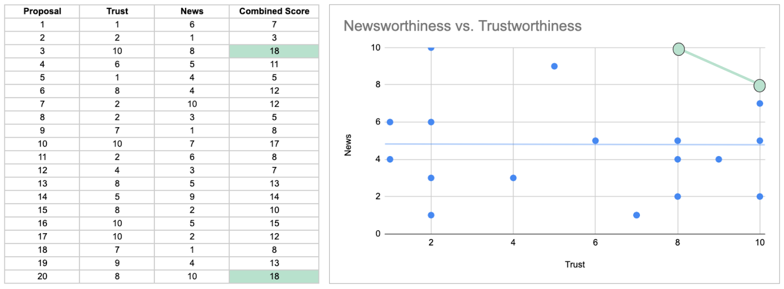
Again, from McElreath: “This is sometimes called Berkson’s Paradox, but it is easier to remember if we call it the selection-distortion effect. Once you appreciate this effect, you’ll see it everywhere. Why do so many restaurants in good locations have bad food? The only way a restaurant with less-than-good food can survive is it is in a nice location. Similarly, restaurants with excellent food can survive even in bad locations. Selection-distortion ruins your city.” Or does it?
This blog post on Mashable by Heather Dockray, persuasively tells that exact story about the inverse relationship between quality of location and quality of food for restaurant franchises. Her conclusion is this: suburban chain restaurant franchises are inherently superior to one’s located in cities. However, I’m not so sure. Dockray uses a very limited amount of data from the Yelp app. Perhaps we can do better? There are a few large Yelp datasets on Kaggle.com. Let’s use one of those to verify.
In this data, we have ~65k restaurant reviews (both in cities and suburbs). As a proxy for quality of location, we have traffic which is data on checkins by customers. As a proxy for quality of food, we have star ratings. While neither of these is perfect (proxies are a proxy for a reason), they can directionally show us if there is a difference between the relationship of location quality and food quality in all the data versus a subset of it.
The visualization and correlation between these metrics for the whole dataset shows a positive relationship (correlation = +0.10), contrary to the neutral assumption that McElreath suggested. However, the visualization and correlation for the highest ranked locations (rank calculated by the combination of location quality and food quality) show a strong negative correlation (correlation = -0.42). Selection bias has led us to an illusory conclusion.

Ok. On one hand, I love the story in that blog post using ‘data’ to back up a really well-crafted narrative. It’s fun to read and it makes me feel like I have this new found worldly knowledge. On the other hand, it’s possible that that knowledge is spurious. There may be sprinklings of truth scattered throughout the story, but it’s probably not sound knowledge to make decisions with. While the repercussions of these decisions (about where to eat) are likely low, the same illusions exist where the stakes are higher. For example, making strategic decisions about your business.
I often like to close my articles with a heuristic you can easily access and use going forward. Here it is: your conclusions depend on what you pay attention to…
—–
To reproduce the visualization, I used two steps; aggregating the data in this Kaggle notebook and visualizing the scatterplot in this gist.