It’s hard to beat the value-add of a good forecast in supply chain. Supply chains are long – thousands of miles with dozens of participants. Without a decent forecast you’ll end up with an abundance of waste in some way, shape, or form. We forecast for manufacturing products, securing transportation capacity, obtaining & using warehouse space & labor, and estimating product sales or order demand (among other things, obviously). Product demand typically feels like a good starting point since it drives those other upstream events. However, it’s also influenced by those upstream events. Having an expectation of product demand allows us to start thinking about how much we need to produce when and where. Production planning is influenced by demand expectations and demand expectations need to be influenced by production planning – it’s not a one way sequential street. This is ultimately why Sales & Operations Planning organizations exist – to attempt to coordinate this. Some businesses do this well. It’s a hard-as-hell problem, especially when you are dealing with millions of SKUs and billions of sales dollars per year. Good forecasting requires discipline and attention and the right tools. It’s helpful to have a framework when doing this. The paragraphs below are for both creators and consumers of a forecast because they highlight some very applicable real world challenges embedded in the problem. There are software platforms out there to help – such as ToolsGroup, but they are expensive and my guess is that with a bit of discipline and some open source software platforms you can still achieve a good forecast (or at least get you 95% of the way there. Enter R. (note that ToolsGroup does have a really good blog in this space).
Right from Wikipedia, “R is a programming language and free software environment for statistical computing and graphics supported by the R Foundation for Statistical Computing.” I don’t intend to include an Intro to R section, so here are some great resources that’ll bring you up to speed quickly; downloading and installing RStudio from RStudio.com, Intro to R on DataCamp.com, and for more advanced techniques Data Analysis with R on Udacity. However, the comments in the attached script (all the way at the bottom of the post) should suffice to allow you to follow along just fine (assuming you download and install RStudio). Note that R isn’t the only option, but in my humble opinion and experience it’s a good place to start (after spreadsheets of course).
Imagine you are running a S&OP organization for a $1B+ revenue manufacturing company. You have, on average, 2,160 SKUs in stock across 33 product categories. In order for your operation to plan manufacturing capacity, labor, and transportation capacity, S&OP will need to provide a 10-week daily demand forecast every 2 weeks at the warehouse and lane level in terms of units and cubic volume. This is a tall order. In other words, every 2 weeks you must produce an updated operational forecast for the company looking 10 weeks ahead for multiple units of measure – units will assist in labor planning for the warehouses and cubic volume will assist in transportation planning for each origin-destination (OD) pair. You will provide a forecast every other week for the coming 10 weeks, but your accuracy will most heavily anchored on the 4-week advance forecast. If you are still thinking this is doable in spreadsheets, I’m very glad you are reading this post. You’ve likely heard the truism that ‘all forecasts are wrong.’ Absolutely! This is a good thing. To not know certainty-of-future is what makes innovation feel so great, it gives us the element of surprise. What we really want to know is the acceptable level of wrongness in our forecast – at what threshold can the operation still plan knowing there will be variation around that forecast? The deeper S&OP contribution is to understand and communicate the why of forecast error and how the company should adjust into the future with those learnings.
In the example from above (the $1B+ manufacturing company), I’m referencing a data file pulled from Kaggle.com of total daily orders for a manufacturing company across its 4 warehouses. There are 2160 unique products across 33 product categories and the dataset contains 1729 unique dates (which with simple math is ~5 years). There are ~1M rows and the data types are all characters across the 5 columns.

To build upon this dataset, we add some derived date variables (Month, Year, Month_Year, DayOfWeek, The_Week). For the unit forecast, we assume 1 order = 1 unit. For the cubic volume forecast I’m going to make some stuff up. I assume each of the 33 product categories has some distinct average cube drawn from a random normal distribution with mean = 2 and standard deviation = 0.5. Shown below, product category 028 has an average shipping cubic volume of 1.40. Lastly I assumed each order was destined to one of 8 random locations in order to create and OD pair (honestly, I’m not going to use the cube or OD pair in the rest of this post but all the methods would apply just as well to those units of measure). Quick note: Don’t be fooled by the aesthetics of the following table (or any table in this post). The data was taken out of R and into Google Sheets… additional formatting was required and I have a link to that sheet at the end of the post.

In the ‘age of big data,’ manually looking through rows and rows of your data may seem frivolous, but it’s the opposite. Pete Warden says it brilliantly in his blog post titled Why You Need To Improve Your Training Data, And How To Do It: “every time I’ve done it, I’ve discovered something critically important about the data.”
From here we’ll take the following approach.
- Conduct an exploratory data analysis (EDA) to create some expectations about our forecasts.
- Create the date framework to help facilitate ease and organization for repeat forecasting.
- Create an initial forecast.
- Determine thresholds for confidence intervals.
- Assess forecast accuracy.
- Inspect variation on input assumptions and bridge forecast error.
Exploratory Data Analysis
Let’s start with a glance at missing values by feature.
![]()
It appears that we have 11239 rows that have missing Dates. Digging in, we find that this is localized to Whse_A mostly in Product Category 019. It’s nearly impossible to tell where the Order Demand belongs. The next step (in real life) would be to chat with the technology teams and the operations teams to figure out why the data isn’t populating for this product category at this location. For now, we’ll take it out of our data (it’s 1.98 x 10^-6 percent of total orders, a micro percentage of the total demand).
With 1729 unique dates, I expected to have ~5 years of data (1729/30 = 57 months or 4.8 years). However, Table 2 shows that we actually have ~68 months or 5.6 years using my ‘dumb’ math and actually spans 7 calendar years. Why the difference? It seems like there is some noise from 2011 and 2017 (2017 not shown below). Take a look at how many orders we have by month from start 2011 to mid-2013:

Without those likely incorrect data points from those months we get closer to our expected 5 years of data. This may seem trivial, but supply chain data work is bursting with this kind of stuff. It’s recommended that you know how to identify it and make decisions about what to do with it. More later but the point for now is having general expectations about your information can help you be sceptical about what the machine initially outputs. From the get go, I’ve filtered our data to include only dates between 2012-01-01 and 2016-12-31 inclusive.
Since we are interested in forecasting orders, it’s healthy to gain a cursory understanding of them. Here’s the summary:
![]()
Fantastic! Some really beautiful outliers. And, they occur across warehouses. Based on the aesthetics, I’m obviously not including the histograms below to make this blog post look great. I’m including them because they are so typical for supply chain data histograms. This data represents the physical world and error data points that occur all the time both on purpose and by accident. Let’s use a traditional method for removing outliers: chop the top and bottom 1% of values. The risk in doing this is that the data we drop contains direly valuable information and we fail to provide reasonable guidance for operators. Remember, you want to remove data points you think happened in error or won’t happen again. In real life, you should understand what this represents and what threat it poses to the business by ignoring it.

Now, finally, we are ready to start plotting some exploratory time-series visualizations. Start basic and build from there – first up is total orders by day over the whole time frame:
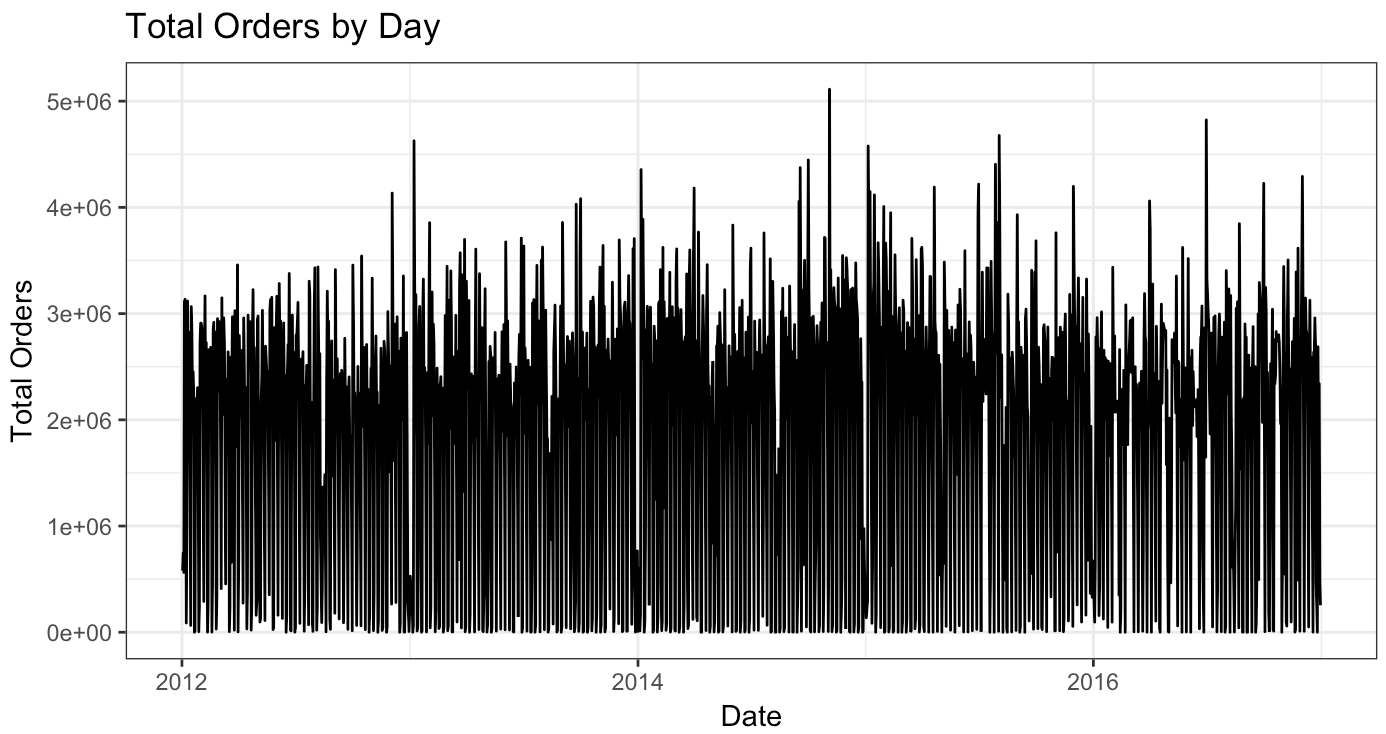
Yuck. It looks awful and doesn’t tell us much. I kept it in because this is generally what my first charts look like (actually, my first charts tend to look even worse!). Let’s try something else – let’s look at total orders by month and Warehouse.

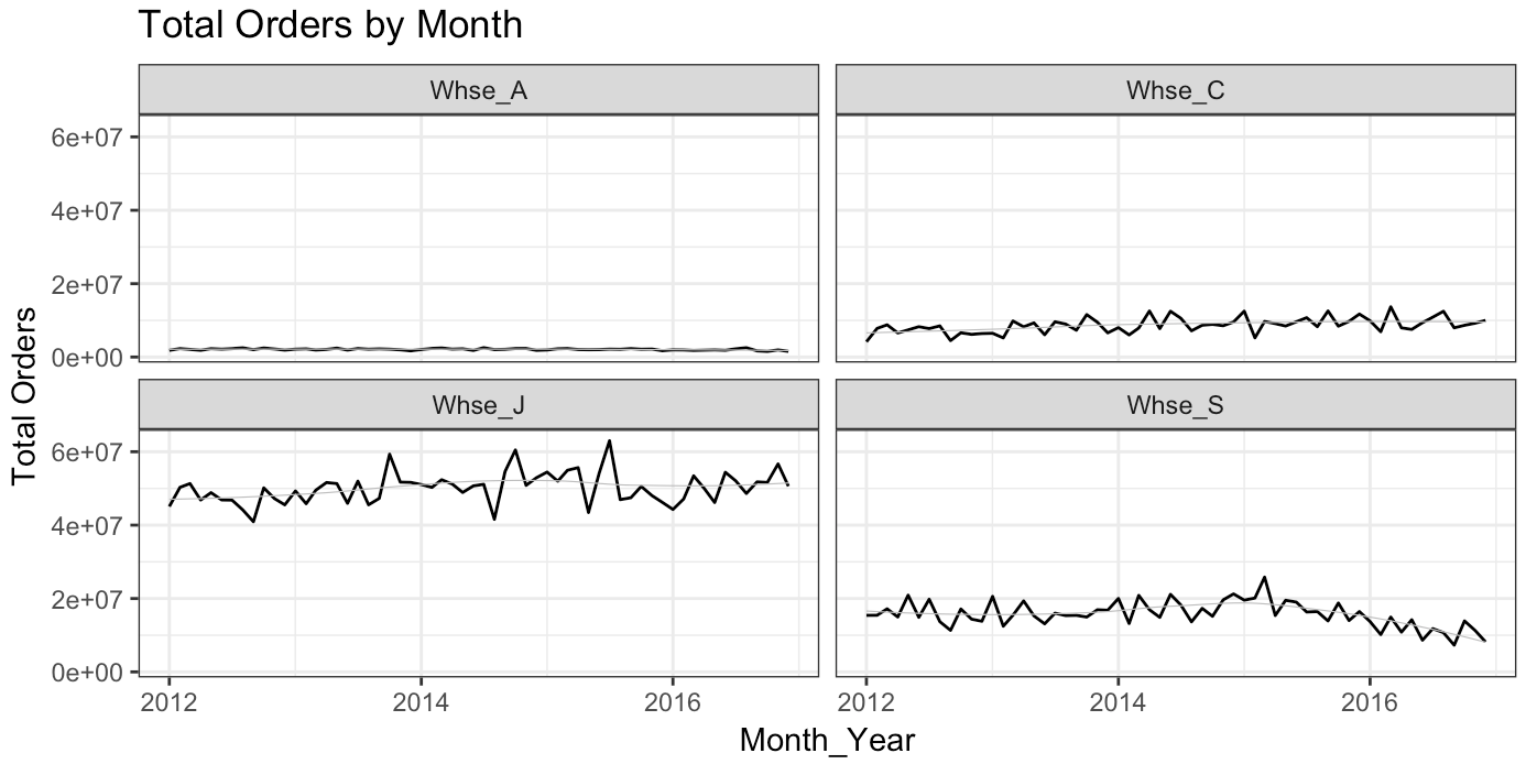
Better and a little more helpful. A few things stand out. First, the aggregate order volume seemed to grow strongly between 2013 and mid-2015 but then fell back to a pre-2013 levels (52-53 million order range). Second, Whse_J fulfills a large bulk of the orders and it feels like it has greater forecast volatility. Quantitatively, we can use the coefficient of variation (cv) to make sure that scale isn’t manipulating our intuition. The results are interesting enough to share the table.

This shows us that relative to the average order value by month, Whse_C & Whse_S actually have the most volatility. This means, I think, that I should expect the most forecast error to occur at these locations and the least from Whse_J (this is no guarantee, but again this EDA is to help us form expectations around what forecast outputs may look like when we get there).
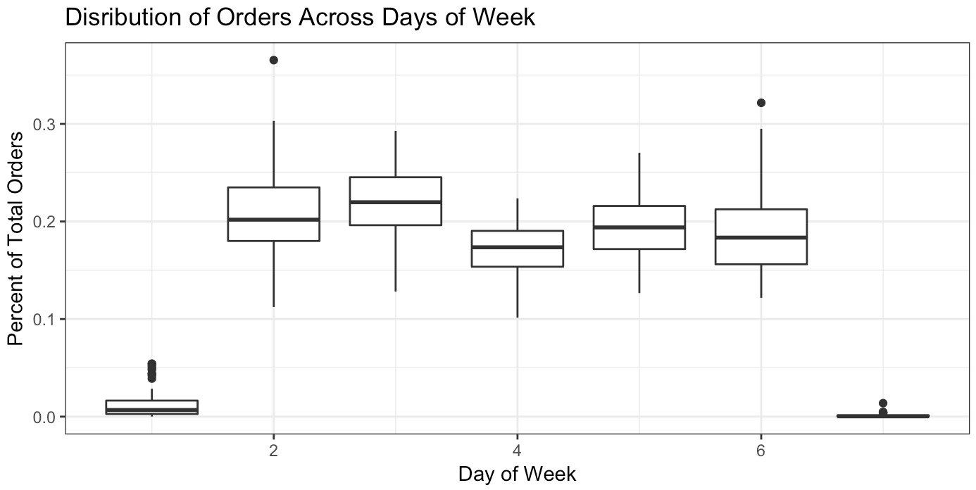
The distribution in which orders fall across the week I refer to as the day-of-the-week curve (dow curve). We can look at this in a few different ways, including plotting a curve. The line charts and boxplots below shows me that we mostly have no orders on weekends – that’s probably the most certain thing we know. Otherwise, the dow curve is not consistent over time. The intuition here is that if you are attempting to predict daily values based only on historical trends, you’ll likely be way off the mark.

Date Framework
It’s easiest to explain this with a picture. Below is the top of the date framework dataframe plus an example timeline for the 1st instance.

Now, for any forecast we will easily be able to calculate and apply recent growth trends. Let’s do that in our initial forecast.
Initial Forecast & Confidence Intervals
Let’s give ourselves a benchmark. Without a forecast, operators may use what they’ve seen the past several weeks as their plan. If we’ve received 100 orders last Tuesday and the Tuesday prior, I’ll plan for 100 orders this Tuesday and next. For businesses with major seasonality swings, they might adapt that to look at last year’s orders and recent growth trends. What is seasonality? Produce harvest season in transportation is a good example – going into March you can’t expect that the recent past will resemble the near future since this is when a large amount of fruits and vegetables are being harvested and being shipped to food manufacturers, grocery stores, and other vendors across the country. Similarly, holiday shopping season between Thanksgiving and Christmas will look nothing like September and October. In these cases, using year-over-year plus an adjustment is likely a better indicator of future sales than simply looking at the past few weeks. As our benchmark, we’ll just say that our forecast 4-weeks from now is the number of orders received today. For example, the number of orders forecast for February 5th 2016 would be the number of orders received on January 8th 2016 (4 weeks prior). Using this methodology, our benchmark forecast error would be 5.2% (overall forecast is 5.2% higher than actual over the forecast date range) with a Mean Average Percent Error (MAPE) of 23,000% (note that there are a few days where we forecast extremely low order numbers — say 2 — but the warehouse gets tens of thousands of orders which bring your MAPE way up). More on these accuracy metrics below.
Our first forecast will be delivered on 2016-01-04. In our date framework, this will be row 27. Assume it’s the morning of January 4th (you have all data through January 4th). You’ll need to produce your forecast to stakeholders by end of day.
![]()
Here’s the sequence we’ll follow for this foundational forecast:
- Find the year-over-year growth from recent period (which is the past 12 weeks from 2015-10-12 to 2015-12-28 compared to 2014-10-13 to 2014-12-29). In our data set it’s -9.98%.
- Find the total volume from the comparable period 1-year ago (2015-01-05 to 2015-03-16). It was 209,486,682 orders (could also be written as 2.09 x 10^8).
- Apply the growth rate from Step 1 to the total order volume found in Step 2. It’s 188,573,975 orders (could also be written as 1.88 x 10^8).
- Find your day-of-the-week curve, by warehouse, from recent period (2015-10-12 to 2015-12-28).
- Find your warehouse distribution curve from recent period (2015-10-12 to 2015-12-28).
- Apply the distribution curves found in Step 4 and Step 5 to the expected order volume for the period found in Step 3 and then apply to the target date range (2016-01-04 to 2016-03-14). You now have a forecast, but no reference point for how good or bad that forecast might be. Let’s create confidence intervals.
- To calculate confidence intervals, we’re going to apply Steps 1-6 above to our dataset using row 22 from our date framework. Forecast delivery date is 2015-10-26 and the target_end date is 2016-01-04. Since in this scenario it is 2016-01-04, we’ll have all the actual orders from that period upon which we can find forecast variance (which is forecast – actual) and create 95% confidence intervals.
- Combine your forecast with the confidence intervals.
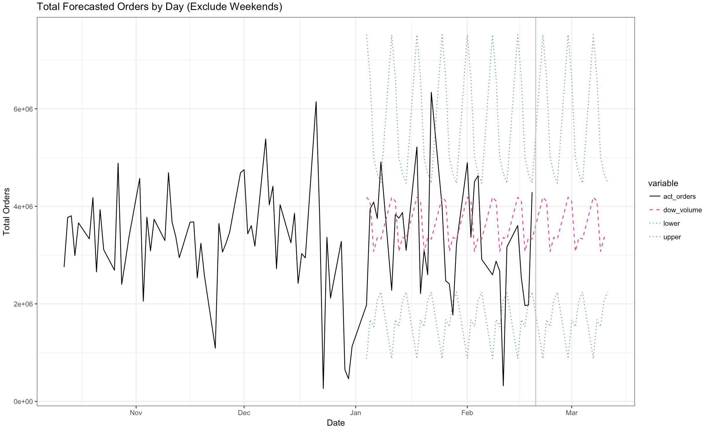
It’s time to present this forecast to stakeholders. You can just send them a data table with the forecasts. However, that likely won’t help generate discussion or questions which can be immensely valuable to catch mistakes. Visuals work better. It will be helpful to plot recent history alongside our forecast to give consumers context (where we’ve been relative to where we are going). The below plot contains A) actual daily orders over the previous 3 months, B) forecasted daily orders over the next 3 months, C) our confidence intervals, and D) a vertical line to distinguish past from future.
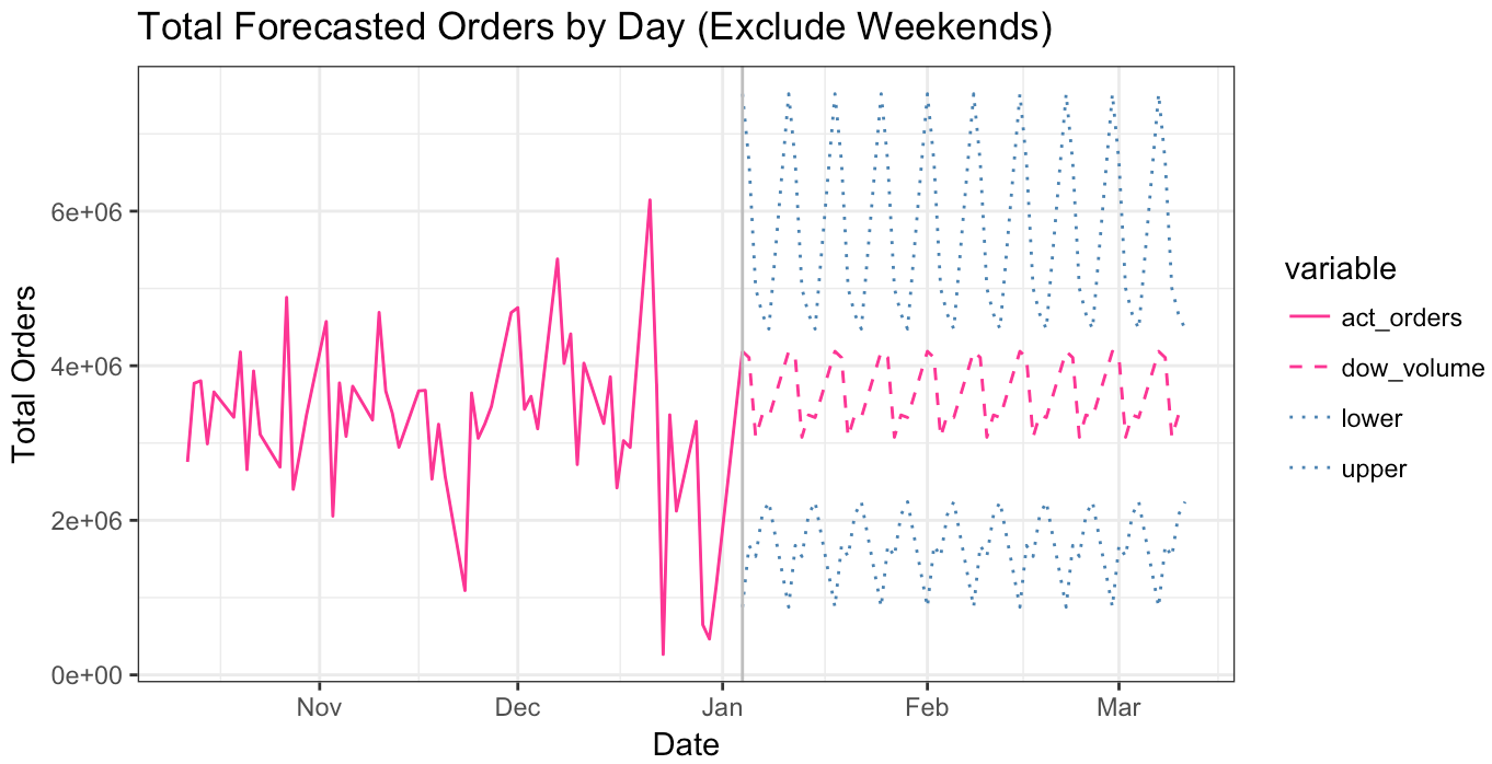

Overall, our confidence intervals range from 1.5 x 10^6 orders to 6.0 x 10^6 orders with the average point forecast being about 3.5 x 10^6 orders. As you go through time, your stakeholders will want to know how you are performing (in terms of accuracy) to forecast. In our scenario, imagine it’s February 15th… how you doing? You can add actual orders to your chart as time goes on to show that variance. Actual orders are bouncy… which is what drives the wideness of your confidence intervals. It looks like actual orders jumped outside those confidence intervals on 4 of the days.
Forecast Accuracy
In addition to these visualizations, let’s put some quantitative measures around forecast accuracy. Remember, based on the coefficient of variation calculation above we expected Whse_C or Whse_S to have the worst forecast. We are going to measure forecast accuracy in two different ways: overall error and MAPE. Overall for the entire period (2016-01-04 to 2016-03-14) our forecast was about 9.8% too high (recall that our benchmark – which is not exactly apples to apples – was 5.2%). We anticipated overall year-over-year growth to be approximately -9.9%… but it turned out to be -19.7%, a far bigger fall than expected. 4.7 percentage points of that 9.9% came from Whse_S and 3.0 percentage points of the 9.9% from Whse_J. By this measure, the forecast for Whse_S was the worst performing.
Second, our mean average percent error (MAPE) comes in at 4.21 or 421% at the day and warehouse level (recall that our benchmark – which is not exactly apples to apples – was 23,000%). This measure of accuracy is useful, in many cases, because it removes the net effect of over/under accuracy in our aggregate number. For example, if your forecast was only for two days and the accuracy was +10% and -10% respectively… your overall number would be 0%. A perfect forecast. The MAPE uses the absolute value of those values (+10%) and shows us that, on average, our forecast was off by 10%. It helps to have different measures of forecast accuracy because they tell us different things about our methods. As expected, our MAPE is worst for Whse_S at 132%.

Inspect Input Assumptions & Error Bridge
That forecast accuracy is quite terrible. The role of forecasters may lie, not in forecast accuracy, but in how they explain and communicate forecast error. Good forecasters will be able to identify and describe to their stakeholders what went wrong and how they are adjusting for that faux pas going forward. As such, our R script is set up to analyze our input assumptions.
Aggregate demand fell further than the forecast called for. While the expected total demand was -9.9% year-over-year, actual total demand was -19.7%. Although almost half of that error is driven by the Whse_S forecast (shown above), what we really want to know is why the company is seeing the aggregate slow down in the first place. At this point, you’d need to identify some sort of macro trend that drove a lower year over year growth rate than we’ve seen in the past few months. Perhaps a new competitor came out of the woodwork. Maybe some type of product recall impacted consumer sentiment. After you figure that out, you could determine if you think it will continue or revert back (or even get worse).
We made three major assumptions. First, the distribution of orders allocated to warehouses would remain constant. It didn’t and most severely impacted Warehouse S. In the table below you’ll see that we expected Warehouse S to fulfill 19.8% of orders, but they only received 16.3%.

Second, since this is a daily forecast we needed to make an assumption on how many orders would drop to a warehouse on a particular day of the week. I called this our day-of-the-week curve. In the table below for Warehouse C, many more orders dropped on Tuesdays and Fridays than expected while significantly less orders dropped on Mondays and Wednesdays. We knew this was a risk based on our day-of-the-week curves plotted during the EDA. It’s likely that daily level granularity for forecasts is not conducive with this operation (as mentioned above when we looked at MAPE).

There was a third intrinsic assumption that we made; the order product mix stayed the same. Depending upon the characteristics and locations of each warehouse, if order behaviors change it’s likely to drive forecast error (especially in transportation). One way to assess if product mix has changed is to create a scatterplot of expected vs actual distributions of product categories with a 45-degree line. If all dots fall on or near the line, the product mix has not changed. Take warning that this doesn’t necessarily mean the characteristics of the Product Categories themselves haven’t changed (introduction of new large cube products would alter the characteristics of the group). In the chart below, I also include blue diagonal bars indicating +/-2% variation. All product categories stay within that threshold. Something to consider is that when product mix is relatively consistent it might be a better starting point for the forecast instead of aggregate trending growth / warehouse fulfillment distribution. Working from both directions would be prudent. Creating different working forecasts using different methodologies can tell you different things… ultimately helping you create the most well-informed, accurate forecast for your stakeholders.

We see three major drivers of forecast variance: uncertainty in macro demand, volatility in which warehouse fulfills order demand, and incorrect dow curve. The most important question is why. Is bulk ordering or promotions driving insane volatility in ordering patterns from the manufacturers customers? That’s one possibility. Without being able to understand that answer, the manufacturer must plan higher toward the upper confidence interval in our forecast (or risk a high degree of cancelled orders due to long lead times). This is a classic example of the bullwhip effect.
Wrap Up
In supply chain, the bullwhip effect is a phenomenon where partners upstream in a supply chain mistake noise as signal based upon recent demand fluctuations. Upstream is considered anything that happens ‘before’ while downstream is anything that happens ‘after.’ In a simplistic supply chain you have raw materials supplier > manufacturer > retailer > customer. The raw materials supplier and manufacturer would be considered upstream while the customer would be considered downstream. If a promotion triggers customers to buy something in large quantities one month without alerting the manufacturer why replenishment orders have spiked, the manufacturer may very well scale up it’s manufacturing capacity for the next several months to respond to the increase in demand they are seeing – alas, they are reacting and planning to a false signal. Don’t let your stakeholders – those consuming your forecast – confuse noise for signal. For more on the bullwhip effect: The Bullwhip Effect in Supply Chain from Brandalyzer and Building a Flexible Supply Chain for Uncertain Times from McKinsey.
At this point, we have a really nice framework set up for repeat forecasting and error analysis. In my humble opinion, this is a brilliant benchmark for being able to massage your historical data to use other time-series forecasting and machine learning techniques. Forecasters can use the above framework to make decisions on how to ‘correct’ historical data that will allow ‘higher-powered’ algorithms to make predictions about future trends.
Google Sheet for formatting tables
